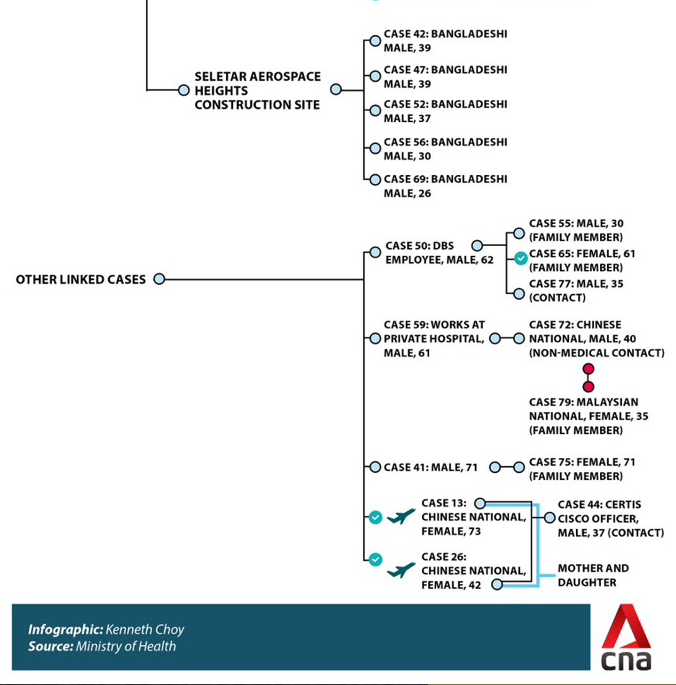
Here Is The Latest Singapore Cluster Tracing Chart For COVID-19
COVID-19 SINGAPORE CLUSTER TRACING CHART – Here is the complete and latest tracing chart for the new coronavirus (COVID-19) in Singapore.
The infographic was created by Kenneth Choy and the source was taken from Singapore’s Ministry of health.
Singapore had been the most hit country by the new coronavirus outside of mainland China. Due to the increasing number of cases, the Philippines said that it was considering a travel ban to and from Singapore.
Singapore is home to about 200,000 Filipinos based on numbers presented by the Philippine Embassy. Because of the report, several of the OFWs residing there were worried about the possible travel ban.
But, the Philippines Foreign Affairs Secretary opposed this idea and stated that Singapore is more than capable of handling the virus.
This truly shows from their initiatives of containment and transparency to the public. In addition, they have made an infographic that showed the COVID-19 clusters in Singapore.


Along with this, Singapore also has a map that revealed where the confirmed infected patients with COVID-19 have been throughout the country.
The map interface is easy to use and already includes a label. RED signifies new cases, YELLOW means updates cases, ORANGE, are cases of the virus, and WHITE showed where the infected had visited.

To access the site, all you need to do is go to their website in the link here.
Thanks for reading. We aim to provide our readers with the freshest and most in-demand content. Come back next time for the latest news here on Philnews.
Like this article? READ ALSO: Armed Gang Steals Toilet Paper As Hong Kong Goes Panic Buying
