How Do You Create A Statistical Infographic? (Answers)
Statistical Infographic – In this article, we will learn about how to create a statistical infographic.
There are actually over 9 types of infographics that you could create to help you visualize data. However, we will be focusing more on Statistical Data.
When you talk about statistics, it may sound boring. Statistics is all about numbers, and nobody wants to focus on just numbers right?
That’s the exact reason why you need some pizzazz in your presentations. Statistical infographics focus on your data, in a way that catches the attention of your audience.
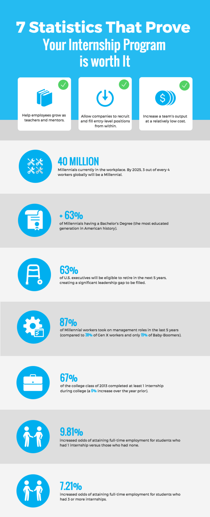
Let’s take this example and break down the important details that went into it.

As you could see in the image above, this infographic uses icons to illustrate each statistic. This leads to statistical data being more intuitive.
Let’s take another example that uses a different approach.

As we could see, this infographic utilizes a lot of vibrant colors that seemingly pops-out as you read it. Right now, we will be giving some tips on creating your own statistical infographic.
Based on an article by Venngage, you first need to:
- Find a story behind your data that could portray your design.
- Use different types of data visualizations like charts, icons, and texts.
- Utilize descriptive infographic titles that gives context to your data
- Spotlight key data points by using contrasting colors or icons that stand out
You could also check out sites like Venggage and take a look at their list of statistical infographic templates. Another option is to use your own customized icons, charts, and pictograms that fit your data.
Thanks for reading. We aim to provide our readers with the freshest and most in-demand content. Come back next time for the latest news here on Philnews.
Like this article? READ ALSO: Writing Styles – What Are The Different Writing Styles?
