Stories Behind Iconic Brand Packages
Iconic Brand Packages of every product has a significant impact on how we view it and the strories behind is worth reading for.
In a consumer taste test for 7-Up, consumers who drank the soda from cans with 15% more yellow coloring in the package design said they tasted more lemon flavor. How we feel, taste, and experience a brand can be significantly altered by the colors, textures, fonts, and compositions on the goods we purchase.
Product packaging and “shelf-presence” are still crucial for brands to enter (and stay) in the consumer consciousness even in the social media era. We’ve looked back at some of the surprising influences on some of the most recognizable and iconic packages in order to provide you with some inspiration.
1. Bear Shaped Honey Bottle
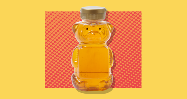
Most likely, the honey you purchased in the past 60 years came in a plastic bottle shaped like a cuddly bear. Have you ever wondered where the concept came from? It seems like the majority of honey producers today choose to package their product in the instantly recognizable shape.
During a dinner with friends in 1957, Dutch Gold Honey Inc. founders Ralph and Luella Gamber first had the idea for the bear-shaped container. Creator of Winnie the Pooh A.A. Pooh Bear, the honey-loving protagonist of Milne’s books, was still receiving a lot of attention even though the author had passed away the previous year. According to Ralph Gamber, “We just figured a bear likes honey, why not a bear of honey?” he said in 1997
2. Kikkoman’s Soy Sauce Bottle

Although it has a sleek, contemporary appearance, the teardrop-shaped Kikkoman soy sauce bottle has been a fashionable standard in restaurants for more than 60 years. Kenji Ekuan, a Japanese industrial designer who lost both his sister and father in the Hiroshima nuclear disaster and who is responsible for the bottle’s distinctive shape, has dedicated his life to making good, useful things.
Based on the article of HubSpot, Ekuan and his team developed more than 100 prototypes for Kikkoman before settling on the iconic bottle we all know and love today: a refined, transparent dispenser with a neck inspired by an inverted teapot spout. They were inspired by the simplicity and elegance of traditional Japanese design. After 300 million bottles, the design is still a crucial component of the Kikkoman brand.
3. The Blue Tiffany & Co. Box
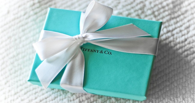
Simple blue boxes tied with white ribbons first made their debut in 1878 and have since come to represent luxury and sophistication all over the world. We’re not inclined to argue with Adweek’s claim that the packaging is “the most recognizable and most desired retail container in history.”
What led Charles Lewis Tiffany, the man who founded Tiffany & Co., to choose this specific shade of blue in the 19th century? Although no one can say for sure, it doesn’t seem random that wealthy women at the time were drawn to this color because turquoise jewelry was so popular.
4. LaCroix’s Colorful Can
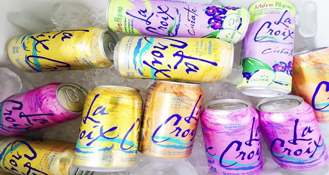
Whether you like it or not, the LaCroix bottle’s kaleidoscopic design stands out in a sea of otherwise plain seltzer bottles. You’d be excused for thinking that this sparkling water company hadn’t updated their logo since the 1990s based on the jazzy font and vibrant color splashes.
In truth, the modern can wasn’t introduced to the world of fizzy drinks until 2002, and one designer called it “swirling hangover puke.” LaCroix hired Lyle Zimmerman, the CEO of Alchemy Brand Group, the branding agency behind successful campaigns for P&G and Coca-Cola, in an effort to stand out in a crowded market. The branding options were presented to National Beverage, the parent company of LaCroix, by Zimmerman’s team.
5. Toblerone’s Triangular Design
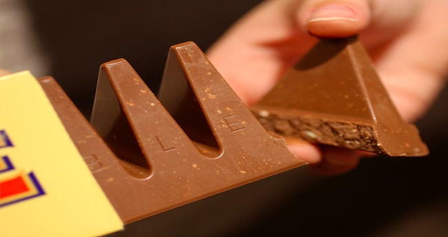
Theodore Tobler, a Swiss chocolatier, decided to produce his honey- and nougat-studded bars in a triangular mold back in 1906, which is a very literal example of thinking outside the box. Emil Baumann, Tobler’s production manager, and the Matterhorn, a Swiss mountain best known for its nearly symmetrical, pyramidal peak, are said to have served as inspirations.
Tobler’s inspiration, however, is the subject of a competing theory. The article mentioned that, Tobler saw a cabaret show at the Folies Bergères in Paris that culminated with the dancers forming a human pyramid. His sons claim that the acrobatic grand finale served as the true source of inspiration for Toblerone’s recognizable shape.
6. Morton Salt’s Pouring Spout
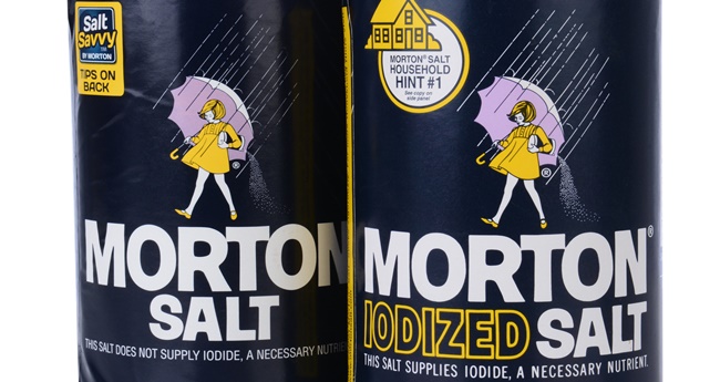
Did you know that Morton Salt was the first company to use this design back in 1911? Nowadays, almost all salt comes in a round package with a pouring spout. Most salt containers at the time were difficult to pour, especially in humid climates.
Salt exposed to the air would clump in humid or wet conditions, making it challenging to pour into salt shakers with precision. This kind of packaging is belong to the iconic brand packages because the purpose of protecting the product from humidity and enabling customers to pour salt in a precise stream, the designers at Morton Salt created this round package with a closeable spout.
7. Heart-Shaped Chocolate Boxes
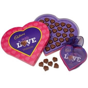
You would struggle to find a chocolate maker that doesn’t sell heart-shaped boxes of assorted truffles around Valentine’s Day. But from whence did this custom originate? Richard Cadbury, the founder of the British chocolate manufacturer Cadbury, is widely credited with creating the heart-shaped candy box in 1861 while looking for a way to utilize the pure cocoa butter that was extracted during the production of drinking chocolate.
This item belong to the iconic brand packages because he came up with a brand-new product called “eating chocolates,” which he packaged and sold in bright, heart-shaped boxes that he himself created.
8. Campbell’s Red and White Soup Can
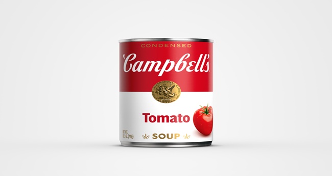
The Campbell’s tomato soup label wasn’t always red and white, as Andy Warhol famously depicted in his series of iconic pop art paintings. In fact, the cans were colored blue and orange when the condensed soup was first introduced in 1897.
What motivated the company to make such a drastic change to their color palette? It was a football game, as it turned out. The company’s treasurer at the time, Herberton L. Williams, went to a college football game between Cornell and University of Pennsylvania in 1898. Williams suggested that Campbell’s modify their packaging to match the Cornell team’s red and white uniforms. It’s difficult to envision Campbell’s cans in any other color combination today.
You may also visit: Extra Ordinary Foods All Over the World